 By simon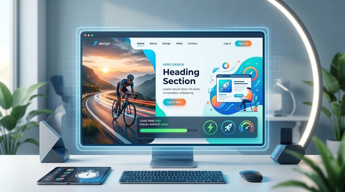
The first thing a visitor sees on your website sets the tone for their entire experience. In 2026, that first impression needs to be both visually arresting and nearly invisible in terms of load time. The hero section is no longer just a pretty picture with a headline. It is a performance-critical piece of real estate where design ambition meets technical reality. Google’s Core Web Vitals are now woven into the fabric of search rankings, and your audience expects a cinematic experience that loads in under two seconds. The good news is that you do not have to choose between a stunning hero and a fast one. The latest design trends and technical approaches let you have both.
The hero section in 2026 demands a balance between bold visual storytelling and ruthless performance optimization. Prioritize lightweight CSS animations over heavy JavaScript, use modern image formats like WebP and AVIF, and adopt a mobile-first approach to layout. By layering typography, gradients, and subtle motion, you can create impact without sacrificing speed.
What Defines a Hero Section in 2026
The hero section has evolved from a static banner into a dynamic introduction to your brand. In 2026, it is defined by three core qualities.
- Speed as a design feature. A hero that loads slowly feels broken. Performance is now part of the visual aesthetic.
- Depth through layering, not weight. Designers use overlapping elements, subtle shadows, and transparency to create richness without adding megabytes.
- Motion with purpose. Animations guide the eye or tell a story. They are never decorative fluff.
The trend is moving away from heavy video backgrounds and toward lightweight, CSS-driven compositions. For more context on how this fits into the broader landscape, check out our guide on top web design trends to elevate your projects in 2026.
The Performance Versus Visuals Tightrope
Every designer knows the tension. You want a full-screen background image, a gradient overlay, animated text, and maybe a subtle particle effect. But each element adds weight.
The trick is to think in terms of perceived performance. A page can technically load in 1.5 seconds, but if the hero section feels sluggish because assets load in the wrong order, the user perceives it as slow. Here is a breakdown of common techniques and their performance impact.
| Technique | Visual Impact | Performance Cost | Best Use Case |
|---|---|---|---|
| Full-screen background video | High | Very high (large file sizes) | Brand storytelling with compression |
| CSS gradient overlays | Medium | Low (pure code) | Adding depth without images |
| WebP or AVIF hero images | High | Low (modern formats) | Photography-heavy designs |
| Lottie animations | High | Medium (vector-based) | Illustrative motion |
| JavaScript particle effects | Medium | High (CPU intensive) | Tech or gaming sites |
| SVG text with animation | High | Very low | Headlines and call-to-action |
The smartest approach in 2026 is to lean into the left side of this table. Use modern image formats and CSS-based effects. Reserve heavy animations for moments where they directly support your message.
A Step by Step Process for Building a Fast, Impactful Hero
Follow this numbered process to create a hero section that performs as well as it looks.
-
Start with mobile constraints. Design the hero for a 375 pixel wide screen first. This forces you to prioritize one clear message, a single call-to-action, and minimal visual clutter. You can add flourishes for desktop later.
-
Choose a hero image format wisely. Avoid JPEG for large hero images. Use WebP or AVIF. These formats offer 25 to 35 percent smaller file sizes at the same quality. If you need a background video, use a compressed MP4 with a poster frame.
-
Build depth with CSS, not images. Use
::beforeand::afterpseudo-elements to create overlays. A dark gradient overlay over a bright image can make white text readable without adding a single kilobyte. -
Add motion with transforms and opacity. CSS transitions on
transformandopacityare GPU-accelerated. Use them for fade-ins, slide-ups, or subtle parallax. Avoid JavaScript libraries for simple animations. -
Optimize font delivery. Use variable fonts or subset your font files to include only the characters you need. This can shave off hundreds of kilobytes. Our article on essential web design fonts to boost user engagement in 2026 covers this in depth.
-
Test with real network conditions. Use tools like PageSpeed Insights or Lighthouse. Do not just test on your local machine. Test on a 4G connection with a mid-range phone.
Typography as the Hero
In 2026, typography is the star of the hero section. Bold, oversized headlines with variable font weights create visual interest without needing a single image. Designers are pairing a heavy sans-serif headline with a light, airy subheadline. The contrast does the work.
Use font-display swap to prevent invisible text while the font loads. And consider using a system font stack as a fallback. If your custom font takes an extra second to load, the page should still look intentional with a system font.
For more on this, see our guide on how to incorporate modern typography into your web design workflow in 2026.
Color and Gradient Trends
Flat colors are giving way to subtle gradients in 2026. A gradient from a deep navy to a soft lavender can create a sense of luxury. These gradients are pure CSS, so they cost nothing in load time.
Pair your gradient with a single accent color for the call-to-action button. This creates a clear visual hierarchy. The eye goes to the button because it is the only solid block of a bright color.
If you are unsure about your palette, our guide on how to choose the perfect color schemes for modern web designs can help you build a cohesive system.
The Role of Micro-Interactions
Small, responsive animations in the hero section make the page feel alive. When a user hovers over the call-to-action button, a subtle scale transform or a color shift provides feedback. These micro-interactions build trust.
But keep them contained. A button hover effect should not trigger a full page animation. Use will-change: transform in your CSS to hint to the browser that an element will move. This optimizes rendering performance.
For a deeper look at this topic, read about 10 micro-interactions that will transform your web design UX in 2026.
Common Mistakes That Kill Speed and Impact
Even experienced designers fall into these traps. Avoid them to keep your hero section in top shape.
- Using autoplay video with sound. This is the fastest way to lose a visitor. If you use video, mute it by default and provide a clear play button.
- Loading all hero assets synchronously. Use lazy loading for below-the-fold content, but prioritize hero assets. Give them a high priority in your preload tags.
- Overusing drop shadows. Heavy box shadows render slowly. Use
filter: drop-shadow()sparingly or stick to flat UI elements. - Ignoring the fold on mobile. What looks like a hero on desktop might push the call-to-action below the fold on a phone. Test on actual devices.
For a full list of pitfalls, see 5 web design mistakes that are killing your conversion rates.
Lazy Loading and the Hero Section
There is a common misconception that lazy loading should apply to everything. Do not lazy load your hero image. The hero section is above the fold. It should load with the initial HTML response. Use lazy loading for images further down the page.
However, you can lazy load secondary elements within the hero, such as a background video that plays only on desktop. Use the loading="lazy" attribute on the video element and provide a static poster frame as the default.
Our tutorial on how to implement lazy loading for faster web design performance in 2026 explains the nuances.
Accessibility in the Hero Section
A visually stunning hero is useless if it excludes users. In 2026, accessibility is a design requirement, not an afterthought.
- Ensure color contrast. Text over a gradient or image must meet WCAG AA contrast ratios. Use tools to check this.
- Provide alt text for hero images. Even if the image is decorative, use a null alt attribute (
alt="") so screen readers skip it. - Make the call-to-action keyboard accessible. Test tabbing through the hero section. The button should be reachable and activatable with the keyboard.
For a complete approach, read designing accessible web interfaces: best practices for inclusive user experiences.
Putting It All Together
The hero section is your handshake with the visitor. In 2026, that handshake needs to be firm, warm, and immediate. You can achieve this by prioritizing CSS-based effects, using modern image formats, and designing for mobile first.
“The best hero sections in 2026 are the ones you barely notice loading. They feel instant because every byte has earned its place.” — A principle every designer should keep on their wall.
Start your next project by sketching the mobile layout. Choose one bold typographic element. Add a single gradient. Then test the load time. Iterate from there. You will find that constraints actually free your creativity.
If you want to see how these principles apply to an entire page, our guide on how to design a landing page that converts in 2026 walks through the full process.
The Future of First Impressions
The hero section will continue to evolve, but the principle remains the same: respect the visitor’s time. A fast, beautiful hero tells the user that you value their attention. That is the most important message you can send in the first few seconds of a visit.
Go ahead and rebuild your hero section with these trends in mind. Strip away the unnecessary weight. Add motion that matters. Use typography and color to tell your story. Your audience will notice the difference, and so will your metrics.