 By simon
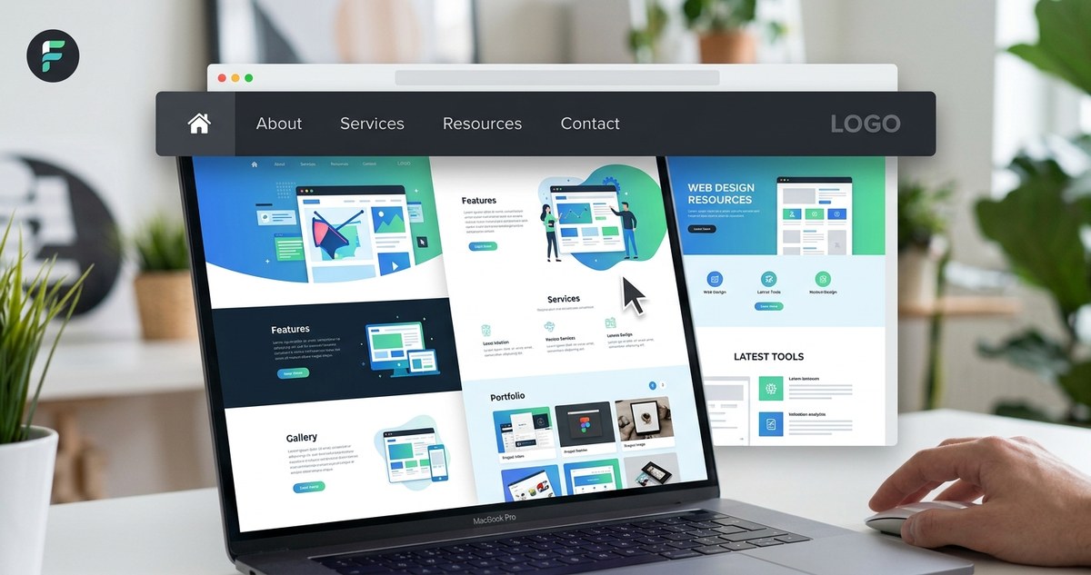
Sticky navigation bars are everywhere. You see them on news sites, e‑commerce stores, and portfolios. When done right, they keep key links visible as users scroll. That small persistence can cut friction, reduce clicks, and make a site feel polished. But when done poorly, a sticky nav becomes a screen‑hogging nuisance that drives visitors away. So how do you get it right?
The answer lies in understanding sticky navigation bar UX as a tool for wayfinding, not just decoration. It should guide users without blocking content, work on every device, and disappear when it needs to. Let’s walk through what makes a sticky nav work in 2026 and how you can implement one that feels natural, not forced.
A sticky navigation bar improves UX by keeping primary actions accessible during scrolling. The trick is to make it contextual, always responsive, and never intrusive. Use a compact design, add a subtle background blur, and consider hiding the bar on scroll down (and showing it on scroll up) to maximize reading space. Test on mobile first, and avoid overcrowding with links.
Why sticky navigation matters more in 2025
User behavior has shifted. People scroll faster, scan more, and abandon sites that make them hunt for the menu. A sticky nav solves that by being a persistent anchor. Think of it like a toolbox within arm’s reach. You don’t have to walk back to the counter every time you need a wrench.
But here’s the catch: in 2025, mobile traffic is still dominant (over 60% of all web visits), and screen real estate is precious. A sticky nav that takes up 80 pixels on a 375‑pixel phone is fighting with your content. That’s why the best sticky navigation bar UX focuses on minimalism and smart behaviour.
The anatomy of a well‑behaved sticky nav
Before diving into code, let’s look at the core principles that separate good sticky navigations from bad ones.
- Height matters. Keep the bar under 60 pixels on desktop and around 50 pixels on mobile. Anything taller eats into your content area.
- Background treatment. Use a semi‑transparent background with a blur effect (backdrop‑filter: blur) so the content underneath is still slightly visible. This creates a sense of layering, not a wall.
- Z‑index management. Set z‑index high enough to sit above other elements, but not so high it overlaps modals or popups.
- Transition smoothness. A sticky nav that snaps instantly feels harsh. Add a small transition (0.2s) to ease it in and out.
Common sticky navigation mistakes (and how to avoid them)
Even experienced designers slip up. Here’s a table of three frequent pitfalls and the fixes that work.
| Mistake | Why it hurts UX | How to fix it |
|---|---|---|
| Overcrowding with links | Users feel overwhelmed and can’t find what they need. | Limit to 5 primary links. Move secondary items to a hamburger menu on mobile. |
| No scroll‑hide behaviour | The bar stays visible when users are deep in reading, wasting vertical space. | Implement “hide on scroll down, show on scroll up” – often called a “smart” sticky nav. |
| Ignoring focus states | Keyboard and screen reader users can’t navigate the sticky bar properly. | Add visible :focus outlines and ensure aria‑current=”page” on active links. |
A simple rule: if your sticky nav has more items than a set of fingers on one hand, it’s too busy. For inspiration, look at how services like GitHub or Dropbox handle their top bars. They strip away anything that isn’t core to the current task.
Step‑by‑step process to design a sticky navigation bar with great UX
Let me walk you through a practical workflow. You can apply this to a new project or retrofit an existing one.
- Map the user flow. List the top 3 to 5 tasks users do on your site. Those become the primary links. Everything else goes into a secondary menu or footer.
- Sketch the layout on a 375px screen. Draw the sticky bar at 48px tall. Place the logo left, links right (or center in a single‑row pattern). Leave space for a search icon or CTA if needed.
- Decide on behaviour. Will the bar stay fixed always, or will it disappear when scrolling down? For content‑heavy pages (blogs, documentation), the “smart” hide pattern works best. For tools or dashboards, a permanent sticky bar is fine.
- Code the CSS with accessibility in mind. Use position: sticky (not fixed) so the bar respects the document flow. Add a skip‑to‑content link at the very top so keyboard users can bypass the navigation.
- Test on real devices. Open the site on an iPhone SE, a Pixel 9, and a 27‑inch monitor. Check if the bar covers important content (like the first heading) when it becomes sticky. Adjust the scroll‑padding‑top on your body to compensate.
Expert advice on keeping it lightweight
“A sticky navigation bar should feel like a convenience, not a sales pitch. If you find yourself adding a logo, four links, a search box, a cart icon, and a ‘Get Started’ button, you’ve turned navigation into a billboard. Strip it back until it feels effortless.”
— Adapted from conversation with senior UX designer at a major publishing platform
This rings true. The best sticky navigation bar UX is almost invisible. Users only notice it when they need it. Think of the way iOS handles notifications: they slide up, feel airy, and disappear when dismissed. Your sticky nav should have that same lightness.
Making the sticky nav responsive and touch‑friendly
In 2026, responsive design isn’t optional. Your sticky nav must adapt gracefully across breakpoints.
- Use relative units. Set height with rem or vh, not pixels. That way it scales if the user changes their browser font size.
- Touch targets. Buttons and links need at least 44pt by 44pt tap areas (Apple’s HIG guideline). If your bar is 48px tall, ensure links span the full height to avoid tiny click zones.
- Avoid hover‑dependent elements. Don’t hide dropdowns behind hover on mobile. Use click or tap to expand, and close them when the user taps outside.
For a deeper look at responsive strategies, see our guide on how to create a responsive hero section that captivates users. The same principles of scaling and touch apply to navigation.
When to break the “always sticky” rule
Not every page benefits from a sticky nav. Consider these exceptions:
- Landing pages that are designed as single‑scroll stories. A sticky bar can distract from the narrative. Let the user flow through naturally.
- Immersive experiences like product showcases or video backgrounds. A persistent bar breaks the full‑screen illusion.
- Mobile‑first reading when the user has zoomed in. Sticky elements can flicker or overlap. Test zoomed states thoroughly.
In those cases, a better option is a floating bottom navigation (for mobile) or a collapsible hamburger menu that stays hidden until triggered.
Visual hierarchy and color contrast
Your sticky nav must remain legible against any background it overlaps. That’s challenging when the page has both dark hero images and light content sections.
- Use a neutral background with a slight opacity (e.g., rgba(255,255,255,0.9)) and a backdrop blur.
- Ensure text contrast meets WCAG AA (4.5:1 for normal text). Tools like WebAIM’s contrast checker can help.
- For the logo, keep it simple. Avoid full‑width images that make the bar feel heavy.
You can pair these tips with advice on how to choose the perfect color schemes for modern web designs to create a harmonious palette.
Measuring the UX impact
Once your sticky nav is live, track these metrics to know if it’s helping or hurting:
- Scroll depth. A sticky nav that works well should correlate with deeper page scrolling. If users bounce early, the bar might be blocking content.
- Click‑through rate on top links. Compare before and after. If a primary link gets fewer clicks, maybe it’s placed wrong.
- Heatmap overlays. Tools like Hotjar show where users hover and tap. See if they try to click the area where your nav sits even when it’s not sticky.
A/B test your sticky nav against a static one. Small changes (like adding a 1px shadow or changing the height) can shift user behaviour by a few percentage points.
Tie it all together: your sticky navigation bar UX checklist
Before you ship, run through this final list:
- [ ] Bar height is 60px or less on desktop, 50px on mobile.
- [ ] Background includes a blur effect and enough opacity to read through.
- [ ] “Skip to content” link is the first focusable element.
- [ ] Scroll‑hide behaviour is active on article pages (hide down, show up).
- [ ] Touch targets are at least 44x44px.
- [ ] No more than five primary links.
- [ ] Focus outlines are visible and high‑contrast.
- [ ] Scroll‑padding‑top is set to the bar’s height so anchor links don’t hide behind the nav.
Designing a sticky navigation bar that improves UX doesn’t require complex JavaScript libraries. It requires empathy for the user’s screen, their task, and their patience. Start with the smallest possible footprint, test on a real phone, and iterate. Your users will thank you with longer sessions and fewer frustrated taps.
For more design principles that support clean navigation, check out 10 web design principles every designer should know in 2026. And if you’re working on the overall visual feel, our guide on how to incorporate modern typography into your web design workflow can help you choose type that stays readable in a sticky bar.
Now go ahead and make that navigation feel invisible. Your users will notice everything except the bar itself.