Minimalist web design is not just surviving in 2026. It is thriving. While bold colors, 3D elements, and experimental navigation are grabbing headlines, the quiet power of a clean, focused interface is what keeps users coming back. The reason is simple: people are overwhelmed. Information overload is real. In a world where every brand fights for attention, giving users a moment of calm is a superpower. This year, minimalism is less about being boring and more about being deliberate. It is about choosing every pixel with purpose.
Minimalist web design in 2026 is not about scarcity. It is about clarity. By prioritizing load speed, accessibility, and intentional whitespace, designers can build sites that convert better and feel effortless. The trend is evolving toward warm minimalism with soft textures, subtle animations, and human centered typography. Embrace less but never cold.
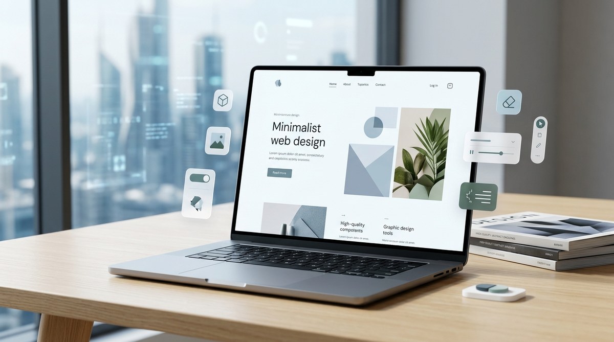
What Minimalism Looks Like in 2026
The old version of minimalism often felt cold. White background, black text, a single image. Those days are gone. In 2026, minimalist web design trends lean into warmth and personality. Think off white backgrounds instead of stark white. Think large, expressive typography that carries the visual weight. Think muted earth tones paired with one accent color. This is “warm minimalism.”
Many designers are blending minimalism with subtle motion. A gentle hover effect on a button. A slow parallax shift on a hero image. These micro interactions make a site feel alive without adding clutter. The goal is to guide the user’s eye without distraction. If you want to see how typography plays a role, check out our guide on essential web design fonts to boost user engagement in 2026.
Another key shift is the use of meaningful imagery instead of generic stock photos. Every photo or illustration should serve a purpose. If an image does not add information or emotional context, leave it out. That is the minimalist mindset.
Why Minimalist Web Design Trends Are Thriving Now
Why is minimalism still relevant five years after it first became mainstream? Three reasons.
Performance. Google and users both hate slow sites. Minimal layouts load faster. Fewer elements mean fewer HTTP requests. If you combine minimalism with modern techniques like lazy loading, your site will fly. Learn how to implement lazy loading for faster web design performance in 2026.
Accessibility. Clean layouts are easier for everyone to navigate. Screen readers have less noise to interpret. Color contrast becomes simpler to maintain. That is a win for inclusivity and for SEO. Read more about designing accessible web interfaces best practices for inclusive user experiences.
Focus. In 2026, the average user has an attention span shorter than a goldfish. A cluttered page scares them away. Minimalism removes friction. It highlights the call to action, the product, or the message. No competition for attention.
3 Steps to Refresh Your Site with Minimalist Web Design Trends
If you are ready to embrace the 2026 version of minimalism, follow this process. It works for a full redesign or a simple refresh.
-
Audit every element on your page. Open your current design. Ask yourself: does this element support the main goal of the page? If not, remove it. Be ruthless. Remove decorative flourishes, extra social icons, and lengthy paragraphs. Replace them with concise copy and clear visuals. After the audit, apply a cohesive color scheme. Our post on how to choose the perfect color schemes for modern web designs can help.
-
Add one layer of warmth. Choose an accent color that feels human. Use a soft, slightly rounded font for body text. Introduce a subtle texture in the background. A tiny grain or a gentle gradient can make a white page feel inviting. Pair that with large, bold headlines. Let them breathe with generous whitespace.
-
Test for speed and usability. Run your new design through performance tools. Check contrast ratios. Verify that every interaction works on mobile. Minimalism only works if the remaining elements are polished. If you need a starting point, look at 5 CSS grid layouts every web designer should master this year to structure your space efficiently.
Common Mistakes to Avoid
Even experienced designers slip up when trying to be minimal. Here is a table of what to avoid and what to do instead.
| Mistake | Why It Fails | Better Approach |
|---|---|---|
| Too much whitespace that isolates content | Users feel lost or disconnected | Use whitespace as a tool to group related items, not scatter them |
| Using tiny fonts for a “clean” look | Hurts readability, especially on mobile | Aim for at least 16px body text; scale headlines generously |
| Removing all color | Creates a sterile, uninviting feel | Choose a primary neutral plus one warm accent (muted gold, sage green) |
| Ignoring visual hierarchy | Even few elements can confuse if not ordered | Apply size, weight, and color to guide the eye naturally |
Avoiding these pitfalls will keep your site minimal but not minimalist to the point of empty.
Tools and Resources for Your Minimalist Workflow
Building a minimalist site does not mean you have to do everything by hand. Use these tools to speed up your process.
- A color palette generator that supports accessible contrast ratios. Use it to find your warm neutral.
- A type scale tool for consistent typography sizing.
- A library of subtle CSS animations (like fade ins) that do not distract.
- A grid system to align elements precisely.
For design inspiration, check out our list of top free vector resources every web designer should use in 2026. And if you are building a new landing page, our guide on how to design a landing page that converts in 2026 aligns perfectly with minimalist principles.
“Minimalism in 2026 is not about removing everything. It is about removing everything that does not serve the user. When you do that, the remaining design feels not only clean but also generous.”
— Lena Park, Lead Designer at Studio Warm
Bringing Minimalism Into Your Next Project
The best time to adopt minimalist web design trends is now. Your users will thank you with longer visits, lower bounce rates, and higher conversions. Start small. Pick one page. Apply the audit. Add warmth. Test the results. You will see the difference.
Minimalism is not a trend that fades. It is a philosophy that adapts. In 2026, it adapts to embrace personality, performance, and inclusivity. That is why it is still winning. Now go create something that feels both spacious and intentional.