You spend money on ads or SEO, drive traffic to your site, and then watch people leave without taking action. It feels like you are pouring water into a leaky bucket. The fix is not more traffic. It is a landing page that earns the click. In 2026, attention spans are shorter, competition is fiercer, and user expectations are higher than ever. The difference between a page that converts and one that flops often comes down to a handful of design decisions. This guide walks you through exactly how to design a landing page that converts using the latest thinking, real examples, and a process you can apply today.
A high-converting landing page in 2026 starts with a crystal-clear headline that matches ad copy. It strips away navigation, uses one primary call to action, and loads in under two seconds on mobile. Social proof must be specific, not generic. Forms should ask only for essential fields. Testing one element at a time, starting with headlines and buttons, consistently lifts conversion rates by 20 percent or more.
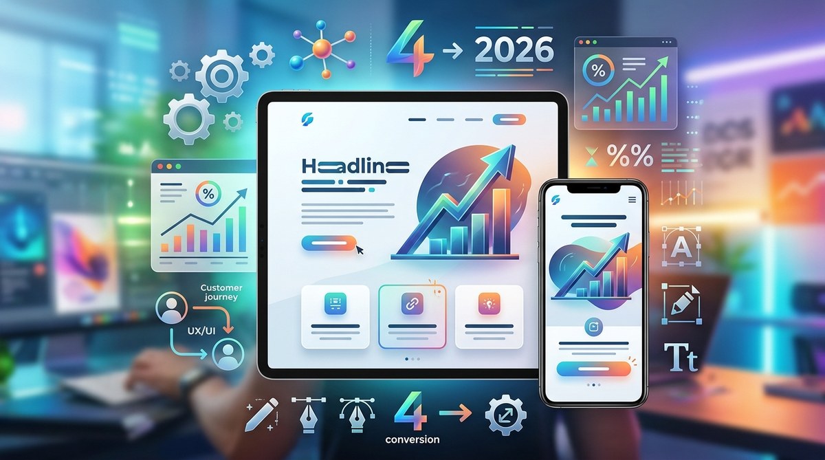
The 2026 Shift in Landing Page Design
Landing pages have changed. Five years ago you could get away with a generic headline, a stock photo, and a long form. Not anymore. Visitors now expect pages that feel personal, load instantly, and respect their time. Google’s Core Web Vitals are a ranking factor, and mobile traffic makes up the majority of visits for most B2C and B2B brands.
The biggest shift is message match. If a visitor clicks an ad promising “Free 30 minute consultation,” the landing page headline must say exactly that. Any gap between the ad and the page kills trust. In 2026, landing pages that convert start with alignment, not creativity. You can get creative inside the page, but the promise must be literal.
The Core Anatomy of a Converting Landing Page
A well designed page has seven core elements. Miss one, and conversion rates drop significantly.
1. A Headline That States the Outcome
Your headline is the first thing people see. It should state the single benefit or outcome your offer provides. Avoid puns, clever wordplay, or brand slogans. If you sell a project management tool, say “Finish Projects Three Weeks Faster.” If you offer a free ebook, say “Download the 2026 SEO Checklist.” Keep it under 12 words.
2. A Subheadline That Adds Context
The subheadline supports the headline by adding a sentence of proof or a brief explanation. Example: “Used by 1,200 marketing teams to ship campaigns ahead of schedule.” This helps visitors understand what they will get and why they should trust you.
3. A Relevant Visual
Images or short videos that show the product, the result, or a real person using the service work best. In 2026, authentic photography beats staged stock photos. Testimonials with a face next to them also count as visuals. Avoid generic illustrations that do not relate to the offer. If you want to create a compelling hero section, read our guide on how to create a responsive hero section that captivates users.
4. A Single, Clear Call to Action
Do not give visitors choices. One primary CTA button stands above everything else. The button text should be action oriented and specific: “Get My Free Quote,” “Start Your Trial,” “Download the Guide.” Avoid vague words like “Submit” or “Learn More.” The button color should contrast with the background but still feel cohesive with your brand. For color advice, check out how to choose the perfect color schemes for modern web designs.
5. Social Proof That Feels Real
Testimonials with full names, job titles, and company logos convert better than star ratings alone. If you have a case study, include a specific metric: “Our revenue grew 34 percent in three months.” In 2026, generic praise like “Great service” no longer works. People want to see themselves in the story. Include one or two short quotes above the fold and a longer testimonial section below.
6. A Frictionless Form
Forms are the biggest conversion killer. Every extra field reduces conversion rates by 10 to 15 percent. Ask only for what you truly need. If you can get by with an email address, do that. If you need a phone number, explain why. Use inline validation so users know if they made a mistake right away, not after hitting submit. For more on form best practices, see our piece on designing accessible web interfaces.
7. Trust Signals for the Skeptical Visitor
Security badges, money back guarantees, privacy policy links, and logos of well known clients all reassure visitors. Place them near the form or the CTA. You do not need a dozen badges. One or two recognizable ones are enough.
A Step by Step Process to Design Your Landing Page
Follow these six steps to build a page that converts from the ground up.
- Match the ad or source. Write down the exact promise from the traffic source. That becomes your headline.
- Sketch the layout. On paper or a wireframe tool, place the headline, visual, and CTA above the fold. Everything else goes below.
- Write the copy before the design. Copywriting drives conversion, not gradients. Draft the headline, subheadline, bullet points of benefits, and the CTA text.
- Choose a single goal. Every element should push visitors toward that one action. Remove external links, navigation menus, and social media share buttons. Keep them on thank you pages only.
- Design for mobile first. In 2026, over 60 percent of landing page visits come from phones. Make sure the headline, visual, and CTA stack well on a small screen. Buttons should be at least 48 pixels tall. Text should scale without zooming.
- Add trust elements. Insert testimonials, a privacy assurance, and a guarantee near the decision point.
Common Landing Page Mistakes (and How to Fix Them)
| Mistake | Why It Hurts | How to Fix |
|---|---|---|
| Too many navigation links | Distracts visitors from the CTA | Remove the main nav; add a sticky CTA button instead |
| Generic headline | No differentiation from competitors | State the specific outcome or time frame |
| No mobile optimization | 50% of mobile users leave if the page is hard to read | Test on real devices; use responsive breakpoints |
| Long forms | Higher abandonment rate | Cut fields to 3 or 4; use progressive profiling for returning visitors |
| Weak social proof | Visitors do not trust the offer | Use full names, photos, and quantified results |
| Too many CTAs | Decision paralysis | One primary CTA; secondary links only in footer |
The Psychology That Drives Conversions
“People do not buy products. They buy better versions of themselves.” — Rory Sutherland
Understanding a few psychological triggers can dramatically improve your landing page design. Loss aversion is powerful: tell visitors what they will lose if they do not act. “This discount expires in 24 hours” works better than “Sign up now.” Social proof triggers the bandwagon effect. Seeing others take action makes people feel they are missing out. Reciprocity works when you give something valuable for free before asking for anything. Even a short checklist or a video tutorial can build goodwill.
In 2026, personalization also plays a role. Dynamic text replacement that changes the headline based on the user’s location or referral source can lift conversions by 15 percent. However, keep it simple. Do not over personalize if it slows down the page. For more on modern design principles, see top web design trends to elevate your projects in 2026.
Mobile Performance and Page Speed Are Non Negotiable
Google’s Core Web Vitals are now older, but they still matter. A page that loads in three seconds has a 32 percent higher bounce rate than one that loads in one second. In 2026, the average mobile landing page takes 8 seconds to fully load. That is too slow. Every second counts.
To improve speed:
– Compress images using modern formats like WebP.
– Lazy load below the fold content.
– Minimize third party scripts.
– Use a content delivery network.
For a detailed walkthrough, refer to our guide on how to implement lazy loading for faster web design performance.
Testing and Continuous Improvement
You cannot design a perfect landing page on the first try. That is why A/B testing is essential. Start with one variable at a time: headline, CTA text, button color, or image. Run the test for at least two weeks or until you reach 100 conversions per variation to get statistical significance.
Track more than just click through rate. Look at lead quality, bounce rate, time on page, and scroll depth. Sometimes a higher click rate leads to lower quality leads. Make decisions based on the full funnel, not a single metric.
Bringing It All Together in 2026
Designing a landing page that converts is not about following a universal template. It is about understanding your audience, matching their intent, and removing every obstacle between them and the action you want them to take. The principles in this guide work whether you are selling a SaaS product, promoting an ebook, or collecting leads for a local service.
Start with the headline. Make it match your ad. Strip away distractions. Show real proof. And test everything. Build one page this week using the steps above. Then iterate. That is how you turn a leaky bucket into a conversion machine.
Ready to design? Grab our free resources on boost your web design workflow with must-have graphic resources to get started.