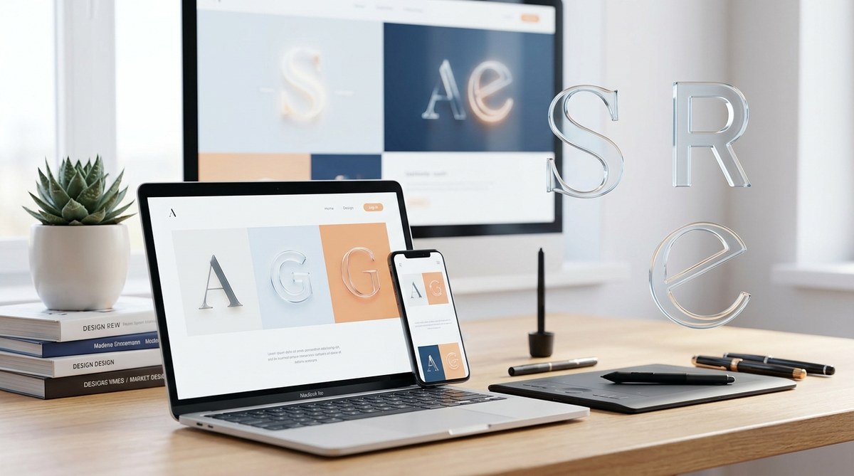
Websites are more than just pretty visuals. Fonts shape how users perceive and interact with your content. In 2024, selecting the right typeface can dramatically boost engagement, convey your brand’s personality, and make your site more accessible. With countless font options available, knowing which ones to choose can feel overwhelming. Luckily, the latest trends and expert picks help you navigate this landscape with confidence.
Choosing the best web design fonts in 2024 involves balancing readability, brand personality, and modern trends. Prioritize clean, versatile typefaces like Inter and Poppins that adapt well across devices and contexts. Experiment with pairing fonts thoughtfully and avoid common pitfalls to create engaging, user-friendly websites that stand out in a crowded digital space.
Why choosing the right fonts in 2024 matters for your website
Fonts are a core part of your site’s identity. They influence how visitors feel and how easily they access your content. The right typeface can establish trust, improve comprehension, and guide users smoothly through your pages. In 2024, the focus is on clarity and accessibility alongside stylish, current aesthetics.
Web design trends shift quickly. What looked modern five years ago might feel outdated today. Staying updated with current font choices helps your site look fresh and professional. Plus, a well-chosen font setup can optimize mobile responsiveness and load times, making your site more user-friendly.
The evolving landscape of web fonts in 2024
Current trends shaping font choices
- Minimalist and clean typefaces dominate, making content easier to read.
- Custom fonts continue to rise, giving brands unique identities.
- Variable fonts allow for flexibility with weights and styles in one file.
- Accessibility remains a top priority, emphasizing legibility and contrast.
- Combining serif and sans-serif fonts is common for visual hierarchy.
Types of fonts gaining popularity
- Sans-serif fonts such as Inter and Poppins for modern, minimal designs.
- Serif fonts like Merriweather for a touch of elegance.
- Display fonts for headlines and branding elements.
- Monospaced fonts for tech-focused or data-heavy sites.
Practical tips for selecting fonts in 2024
- Focus on readability across devices.
- Match fonts to your brand personality.
- Use font pairing to create contrast and hierarchy.
- Limit the number of fonts to maintain visual coherence.
- Test accessibility by checking contrast and size.
How to pick the best web design fonts in 2024
1. Define your website’s purpose and tone
Your font choice should reflect your brand’s voice. A playful blog might opt for friendly, rounded typefaces, while a corporate site calls for clean, professional fonts. Clarify what you want your visitors to feel and how they should interact.
2. Prioritize readability and accessibility
Avoid overly decorative fonts for body text. Instead, choose typefaces that are easy to scan and distinguish. Use tools like contrast checkers and size guidelines to ensure your fonts work well for all users.
3. Experiment with font pairing
Pair a strong headline font with a legible body font. For example, combine a display font like Bebas Neue with a neutral sans-serif such as Open Sans. This creates visual interest without sacrificing clarity.
4. Use web-safe and optimized fonts
Select fonts optimized for web use. Google Fonts remains a reliable resource for free, high-quality typefaces that load quickly and look sharp on any device.
5. Test across devices and contexts
Preview your site on smartphones, tablets, and desktops. Adjust size, weight, and spacing as needed. Solicit feedback from real users to catch issues early.
The top web design fonts to include in your 2024 toolkit
Here’s a curated list of typefaces that are trending and proven to boost engagement:
- Inter: Designed for digital screens, Inter offers excellent legibility and versatility. It’s perfect for body text and interface elements.
- Poppins: With its geometric style, Poppins works great for headlines and branding. It’s modern and friendly.
- Open Sans: A classic sans-serif font known for clarity and neutrality. Ideal for long-form content.
- Montserrat: Bold and stylish for headlines, it adds a contemporary touch.
- Merriweather: A serif font that lends a traditional, authoritative feel to content.
- Fira Sans: Developed for digital environments, Fira Sans combines readability with a modern aesthetic.
- Lora: A serif font that balances elegance with readability, suitable for blogs and editorial sites.
- Raleway: Thin lines and clean curves make Raleway a sophisticated choice for headings.
Practical process for implementing fonts
- Identify your main font for headings.
- Select a complementary font for body text.
- Test pairings in your design prototypes.
- Optimize loading by choosing subsets and font weights wisely.
- Apply consistent typography rules across your website.
Common mistakes to avoid
| Mistake | Explanation |
|---|---|
| Overusing multiple fonts | Creates visual chaos and reduces clarity. |
| Ignoring mobile responsiveness | Fonts may look distorted or unreadable on small screens. |
| Skipping accessibility checks | Can alienate users with visual impairments. |
| Choosing trendy fonts over usability | Style should never compromise readability. |
“Typefaces are the voice of your website. Select them thoughtfully, and your visitors will thank you.” — Jane Doe, typography expert
How to effectively pair fonts and avoid design pitfalls
- Use contrasting styles, such as a serif headline with a sans-serif body.
- Limit your font palette to two or three typefaces.
- Maintain consistent spacing and sizing.
- Test font combinations in your actual design context.
Here’s a quick comparison of techniques:
| Technique | Benefit | Pitfall |
|---|---|---|
| Pairing serif with sans-serif | Creates hierarchy and visual interest | Overcomplicating with too many fonts |
| Using similar font weights | Keeps design cohesive | Might look monotonous |
| Combining display and body fonts | Highlights key messages | Risk of clashing styles |
Final thoughts on shaping your website’s typography in 2024
Picking the best web design fonts in 2024 is about more than just style. It’s about clarity, accessibility, and aligning with your brand. Focus on versatile typefaces like Inter and Poppins that adapt seamlessly across platforms. Remember, thoughtful pairing and testing can turn a good website into an engaging one.
Typography can be a powerful tool for guiding users and reinforcing your message. Don’t shy away from experimenting with current trends but keep your audience’s experience front and center. When you choose fonts carefully, your website becomes more welcoming, easier to navigate, and more memorable.
Keep your fonts fresh and your website engaging
Start by analyzing your content and audience needs. Select fonts that resonate with your brand and serve your goals. Regularly review your typography choices as trends evolve. With confidence and a strategic approach, your website will stand out in 2024 and beyond.