 By simon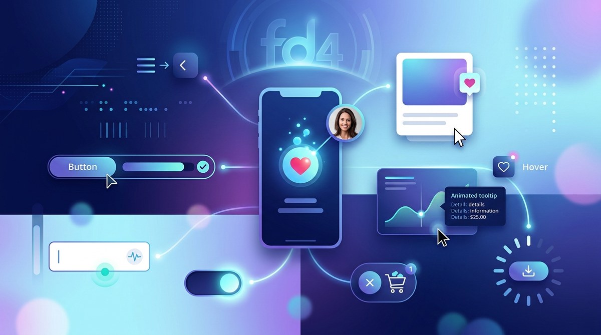
A button that shimmers when you hover. A progress bar that pulses with life. A subtle haptic buzz when you toggle a switch. These tiny moments often go unnoticed, yet they shape how we feel about a product. They turn a functional interface into something memorable. That is the quiet power of micro-interactions UX design.
In 2026, users expect more than just speed and reliability. They crave interfaces that respond with personality and intention. A well-crafted micro-interaction can reduce friction, guide behavior, and make your product stand out. This guide will show you how to design micro-interactions that feel human, not robotic.
Micro-interactions are small, single-purpose moments in a user interface that provide feedback, show system status, or guide the next step. In 2026, the best micro-interactions prioritize context, performance, and accessibility. This article covers what they are, how to design them, common pitfalls to avoid, and a practical process you can apply today.
What Makes a Micro-Interaction Work?
A micro-interaction has four core parts: the trigger, the rules, the feedback, and the loops or modes. The trigger is what starts it. The rules define what happens. The feedback is how the user knows something occurred. The loops or modes handle repetition or special states.
For example, think about the “like” button on a social platform. The trigger is a click. The rule is that the count increases by one and the icon fills. The feedback is the color change and the subtle bounce animation. The loop handles the case where you unlike it.
The best micro-interactions follow these principles:
- Context over flash. A loading spinner that shows actual progress matters more than a clever animation that hides the wait.
- Performance is part of the design. A micro-interaction that lags feels broken. Keep animations under 300 milliseconds for feedback and under 1 second for transitions.
- Accessibility must be built in. Users with motion sensitivity should have a way to reduce or disable animations. Always honor the
prefers-reduced-motionsetting.
Common Mistakes That Ruin Micro-Interactions
Even experienced designers can get carried away. Here is a table that shows common mistakes and their better alternatives.
| Mistake | Why It Hurts | Better Approach |
|---|---|---|
| Overly long animations | Users feel stuck waiting. | Keep feedback under 300ms. Use transitions under 1s. |
| No clear trigger | Users don’t know what to click. | Make interactive elements visually distinct. |
| Ignoring motion preferences | Can cause nausea or distraction. | Always support prefers-reduced-motion. |
| Feedback that feels disconnected | Confuses users. | Match animation style to the action (e.g., a delete action should feel firm). |
| Looping animations without pause | Creates visual noise. | Loop only for loading states. Stop after completion. |
A Practical Process for Designing Micro-Interactions
Use this numbered list as your workflow when adding a new micro-interaction to a project.
- Identify the moment. Ask yourself: what single user goal does this interaction serve? Is it confirming an action, showing progress, or preventing an error?
- Define the trigger. Will it start on hover, click, scroll, or a system event? Keep it predictable.
- Write the rules. What happens step by step? Document the before, during, and after state.
- Design the feedback. Choose the right modality: visual, sound, or haptic. For 2026, micro-interactions often combine subtle motion with a gentle sound cue.
- Test with real users. Watch if they notice the feedback. If they don’t, the interaction is too subtle. If they find it annoying, it is too loud.
- Optimize for performance. Use CSS transforms and opacity changes. Avoid animating layout properties like
widthortopwhich cause repaints. - Add accessibility controls. Provide a toggle in settings for reduced motion. Test with a screen reader to ensure feedback is conveyed in text form as well.
Types of Micro-Interactions You Should Use in 2026
Here is a bulleted list of micro-interactions that work well for modern web design.
- State changes. A toggle switch that slides and changes color. A button that shifts from “Subscribe” to “Subscribed” with a checkmark.
- Progress indicators. A form step counter that animates as the user completes each section. A file upload bar that shows a playful bounce when finished.
- Error prevention. A password field that shows strength in real time with a color gradient. A date picker that gently shakes if the user selects a past date.
- Confirmation cues. A trash icon that opens slightly before deleting. A “sent” message that floats upward and fades.
- Guidance. A tooltip that appears with a soft fade when the user hovers on a new feature. A scroll indicator that pulses at the bottom of a long page.
“The best micro-interactions feel invisible. They do not ask for attention. They simply make the interface feel alive and responsive to the user’s intent.” – Dan Saffer, author of Microinteractions: Designing with Details
How to Avoid Animation Overload
Too many micro-interactions can overwhelm users. In 2026, the trend is toward restraint. Use animation only when it serves a clear purpose. A good rule of thumb: if you can remove the animation and the interface still works, the animation is decorative, not functional. Decorative animations are fine for brand moments, but they should never block the user’s task.
Consider the context of use. A productivity app needs calm, subtle feedback. A gaming platform can be more playful. Match the tone of the micro-interaction to the brand personality. For example, a finance app might use a solid, linear progress bar, while a creative tool might use a dotted line that fills with color.
Tools and Resources for 2026
You do not need to build micro-interactions from scratch. Many design tools and libraries now include ready-made components. For prototyping, Figma has plugins that let you test timing and easing curves. For development, libraries like Framer Motion (React) and GSAP give you fine control over animation. Just remember to strip out unused code to keep bundle sizes small.
If you are looking for inspiration, study how major apps handle common actions. Notice how a messaging app shows a “typing” indicator. Look at how a note-taking app animates a card when you archive it. These patterns are proven and can be adapted to your own projects.
The Role of Micro-Interactions in Accessibility
This is a critical point for 2026. Micro-interactions UX design must include users who rely on assistive technology. A visual animation is useless to someone who cannot see it. Always pair visual feedback with text or audio cues. For example, when a user submits a form, show a success message in the DOM and move focus to it. Do not rely solely on a checkmark animation.
Also, respect user preferences. The prefers-reduced-motion media query lets you serve a static version of the interaction. Some users have vestibular disorders that make motion triggers feel sick. By honoring this setting, you show that your design cares about all people.
Tying Micro-Interactions to Broader Design Trends
Micro-interactions do not exist in a vacuum. They work best when they align with your overall design system. If you use a consistent color palette and typography, the micro-interactions will feel like a natural extension of the brand. For a deeper look at how these details fit into the bigger picture, check out our guide on top web design trends to elevate your projects in 2026.
Similarly, the fonts you choose affect how micro-interactions feel. A rounded font paired with a bouncy animation can feel friendly. A sharp, geometric font paired with linear animations feels professional. Read more about this in essential web design fonts to boost user engagement in 2026.
Your Next Steps for 2026
Start small. Pick one interaction in your current project and refine it using the process above. Maybe it is the hover state on a call-to-action button. Maybe it is the loading state for a dashboard widget. Apply the rules, test the timing, and check for accessibility.
Micro-interactions are not a trend. They are a fundamental part of good UX that will only grow more important as interfaces become more conversational and adaptive. By focusing on the details, you build trust and delight. And that is the kind of design that keeps users coming back.