 By simon
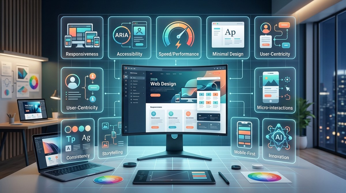
Design rules shift every year, but some principles carry more weight than others depending on the tools, trends, and user expectations of the moment. In 2026, the line between a good website and a great one comes down to how well you balance visual storytelling with genuine usability. AI assistants are everywhere, attention spans are shorter than ever, and users expect sites to feel personal, fast, and inclusive by default. The principles that worked five years ago still matter, but they need a refresh. Here are the ten web design principles you need to build sites that actually work in 2026.
Web design in 2026 is about blending timeless usability with modern expectations like AI integration, dark mode, and performance optimization. The ten principles in this guide move beyond theory into practical workflow changes. You will learn how to design for accessibility first, use motion with purpose, reduce cognitive load, and align every visual choice with real user goals.
Why These Principles Matter More Now
Web design is no longer just about making things look pretty. In 2026, designers must consider how AI scrapes and interprets content, how users interact across foldable screens and wearables, and how accessibility laws are tightening across the US and Europe. If you ignore these shifts, your site risks losing traffic, trust, and conversions. These principles help you stay ahead without reinventing your entire process.
1. Design for Accessibility First
Accessibility is not an afterthought. It is a baseline requirement. In 2026, WCAG 2.2 is widely adopted, and lawsuits over inaccessible websites continue to rise. Design with contrast ratios of at least 4.5:1 for normal text, provide meaningful alt text for every image, and make sure all interactive elements are fully keyboard navigable.
Start your color palette with accessibility in mind. Tools like the WebAIM contrast checker help you test combinations before you commit. If you need guidance on building inclusive layouts, check out this guide on
One practical trick: Design in grayscale first, then layer in color. When your layout works without color, it almost always works with it.
2. Prioritize Content Hierarchy Over Decoration
Users scan, they do not read. The strongest layouts guide the eye naturally from headline to supporting details to action. Use size, weight, and spacing to create a clear reading path. Your H1 should dominate the page. Body copy should sit at 16px or larger. Keep line lengths between 50 and 75 characters for comfortable reading.
A table helps clarify the difference between common mistakes and better approaches:
| Common Mistake | Better Approach |
|---|---|
| Using multiple decorative fonts | Stick to one or two typefaces with clear contrast |
| Centering long paragraphs | Left align body text for better readability |
| Overloading hero sections with text | Use one strong headline and a single supporting sentence |
| Hiding navigation behind hamburger menus on desktop | Keep primary navigation visible on larger screens |
For more on font choices that support hierarchy, read about
3. Use Motion With Clear Purpose
Motion design adds energy, but too much animation creates motion sickness and slows performance. In 2026, users expect subtle, functional motion that communicates state changes or directs attention. Think loading indicators, hover transitions on buttons, and smooth scroll between sections. Avoid auto playing carousels and decorative animations that serve no function.
Respect the user’s system preference for reduced motion. Use the prefers reduced motion CSS media query to tone down or turn off animations for people who need it. If you want to build animations that both perform well and look polished, check out this piece on
4. Design for the Foldable and Variable Screen Era
In 2026, your site will be viewed on phones, tablets, laptops, foldables, and even smart glasses. Responsive design is no longer enough. You need adaptive layouts that adjust not just to screen width but to aspect ratio, fold creases, and multitasking modes.
Use CSS Grid and container queries instead of media queries alone. Container queries let components resize based on their parent container, not the viewport. This makes layouts far more resilient across devices. For a deeper look at modern layout techniques, see
Test your designs on real devices or use browser emulators that simulate foldable screens. Pay attention to how your navigation behaves when the screen is split in half.
5. Optimize for Speed Without Sacrificing Visual Quality
Page speed affects everything: SEO rankings, conversion rates, and user trust. In 2026, Google continues to use Core Web Vitals as a ranking signal. Your site should load under 2.5 seconds on mobile. Use next gen image formats like WebP and AVIF, lazy load below the fold images, and reduce JavaScript bundle sizes.
A bulleted list of performance wins you can apply today:
- Compress all images to under 100 KB where possible
- Use system fonts or variable fonts to reduce font file sizes
- Implement code splitting for JavaScript frameworks
- Serve static assets through a CDN
- Preload critical CSS and defer non essential scripts
For a step by step guide on lazy loading, read
6. Design for AI Scraping and Context
AI assistants like ChatGPT, Google Gemini, and Perplexity now summarize website content for users. If your site is not structured for machine reading, you lose visibility. Use semantic HTML5 elements like <header>, <main>, <article>, and <footer>. Write clear, descriptive headings that work as standalone summaries. Include structured data markup (JSON LD) for articles, products, FAQs, and events.
Think of your site as having two audiences: humans and AI crawlers. Both need clear signposts. For more on how AI is changing design workflows, see
7. Embrace Dark Mode as a First Class Citizen
Dark mode is no longer a gimmick. It is an expected feature for most users, especially on mobile devices and in low light environments. Design your dark mode variant from the start rather than converting it later. Use true blacks sparingly; they create too much contrast against bright text. Instead, use dark grays like #121212 for backgrounds and off whites for text.
Test every UI element in both modes. Buttons, form fields, and images that looked fine in light mode can break in dark mode. For a complete walkthrough on implementation, check out
“Dark mode is not just about aesthetics. It reduces eye strain, saves battery on OLED screens, and signals that your team cares about user preference.” – UX designer at a major SaaS company
8. Reduce Cognitive Load With Consistent Patterns
Users should not have to relearn how your site works on each page. Keep navigation, button styles, form layouts, and iconography consistent across the entire experience. Use established UI patterns like sticky headers, breadcrumb trails, and clear error messages. When users feel lost, they leave.
A numbered process for auditing your site’s consistency:
- Walk through your homepage and identify your core navigation structure, button styles, and form inputs.
- Visit three inner pages and compare them against the homepage. Note any differences in alignment, spacing, or color usage.
- Run the same audit on mobile view. Consistency often breaks down on smaller screens.
- Document your findings in a simple style guide or design system.
- Fix mismatches and schedule a quarterly review.
For help building a proper design system, read
9. Choose Color With Psychology and Contrast in Mind
Color evokes emotion, but it also drives usability. In 2026, bold color palettes are popular, but they must be applied with restraint. Use your primary color for key actions and links. Use secondary colors for accents and supporting elements. Keep neutral colors for backgrounds and text.
Avoid relying solely on color to convey meaning. Add text labels, icons, or patterns alongside color coded information. This helps users with color blindness and makes your design more robust across different viewing conditions. For a deeper understanding of color strategy, see
10. Test With Real Users and Real Data
Design assumptions are dangerous. What looks good in Figma often fails in the real world. Run usability tests with people outside your team. Use session recording tools to see where users hesitate, click, or drop off. Analyze your analytics data for patterns: high bounce rates on certain pages, low click through on CTAs, or confusing navigation paths.
A/B test one change at a time. Test a headline variation, a button color shift, or a different form layout. Let data guide your decisions, not gut feelings. For more on designing pages that convert, see
Building Your 2026 Design Workflow
These ten principles work best when you apply them together. Accessibility supports hierarchy. Speed supports usability. AI readiness supports discoverability. Start with the principle that feels most urgent for your current project, then layer in the rest over time.
Design is not about following trends blindly. It is about understanding how people interact with technology and making those interactions smoother, more inclusive, and more enjoyable. In 2026, the best designers are not the ones who chase every new tool. They are the ones who stay grounded in fundamentals while adapting to the shifting landscape.
Pick one principle from this list and apply it to your next project. Notice the difference it makes. Then pick another. That steady, intentional approach is what separates good designers from great ones.