 By simon
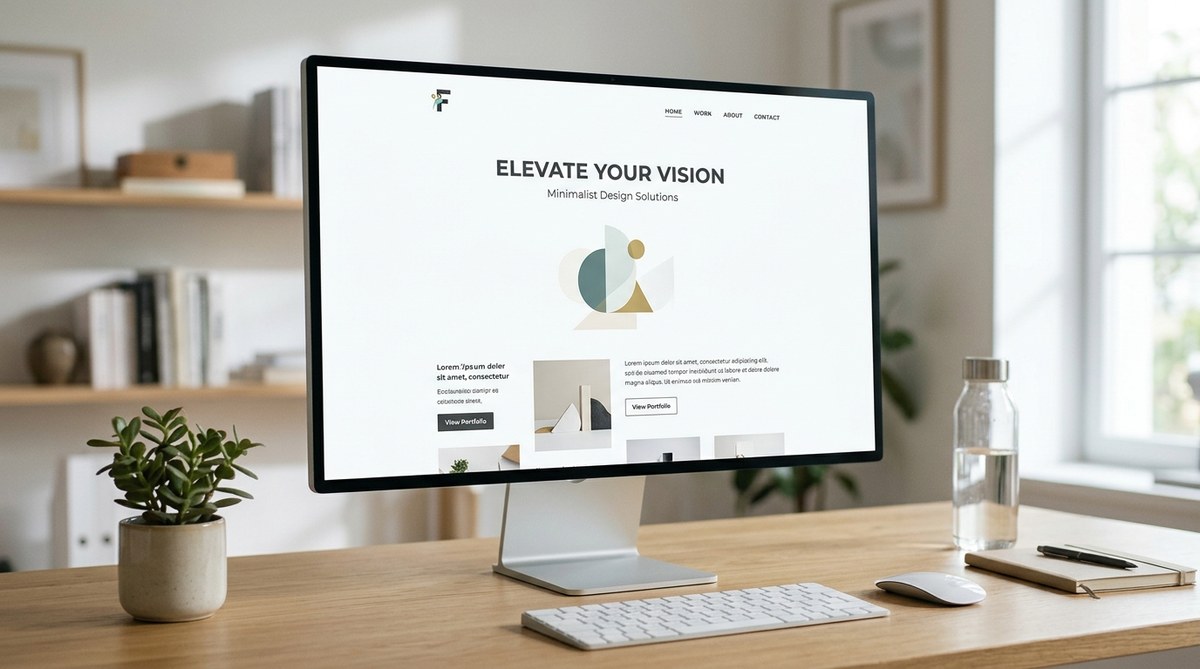
White space in web design is often misunderstood. Many beginners think it means wasted space. The opposite is true. White space, also called negative space, is the breathing room between elements. It gives your layout structure, clarity, and a premium feel. When used well, it guides the user’s eye and makes content easier to digest. In 2026, with more content than ever competing for attention, mastering white space can set your designs apart.
White space is an active design element, not an afterthought. It improves readability, creates visual hierarchy, and increases user engagement. To master it, focus on both micro and macro spacing. Use generous padding, consistent margins, and intentional gaps. Avoid cramming content or filling every pixel. When you let elements breathe, your design feels more professional and trustworthy. This guide will show you practical steps, common mistakes, and expert tips to use white space effectively in any web project.
What White Space Really Means
White space is the area in a layout that is left intentionally blank. It can be any color, not just white. It sits between text, images, buttons, and other components. There are two main types:
- Micro white space: Small gaps inside a component, like the padding inside a button or the space between letters (tracking). It improves readability at a granular level.
- Macro white space: Large gaps between major sections, such as the distance between a hero area and the next content block. It helps users scan and understand the page structure.
Both types work together. Micro spacing makes text comfortable to read. Macro spacing creates visual rhythm.
Why White Space Matters for Your Users
The benefits of white space go beyond aesthetics. Here is how it works for your audience:
- Boosts readability. Text surrounded by enough space is easier on the eyes. Reading becomes less fatiguing, especially on mobile screens.
- Creates focus. When you leave room around a call to action or key message, that element gets more attention. Users naturally look at the area with the most breathing room.
- Establishes hierarchy. Larger gaps signal a new section. Smaller gaps group related items. This helps users understand the importance of each piece of content.
- Increases conversions. Studies show that landing pages with ample white space have higher click through rates. A clean layout feels more trustworthy.
- Supports accessibility. Proper spacing makes content accessible to people with visual impairments or cognitive disabilities. It reduces clutter and confusion.
For more on how layout affects user behavior, check out our guide to top web design trends to elevate your projects in 2026.
How to Apply White Space in Your Web Designs
Follow these practical steps to add white space without losing content value.
-
Start with a generous grid system. Use a 12 column grid with wider gutters. Aim for at least 24px between columns on desktop. This forces you to distribute content evenly.
-
Set generous padding around every component. Give text blocks at least 16-24px of internal padding. Buttons should have 12-20px on each side. Lists and form fields need similar breathing room.
-
Leave space above and below headings. A heading should have more margin above than below. A common ratio is 2:1. For example, 48px above and 24px below an H2.
-
Separate sections with clear visual breaks. Use 60-120px of vertical space between major sections. On mobile, reduce this to 40-60px. Do not rely solely on lines or dividers.
-
Test with a “squint test”. Squint your eyes at your design. If you see a solid block of gray (text) with no light gaps, you need more white space. Aim for balanced light and dark areas.
-
Use the rule of thirds for important elements. Place your primary call to action where the grid lines intersect. Give it extra space around it to stand out.
Common White Space Mistakes to Avoid
Even experienced designers sometimes misjudge spacing. Here is a table of typical errors and how to fix them.
| Mistake | Why It Hurts | How to Fix It |
|---|---|---|
| Cramming too many elements above the fold | Overwhelms users; reduces clarity | Keep only one primary message and one action above the fold. Move secondary content down. |
| Inconsistent spacing between similar elements | Breaks visual rhythm; looks messy | Use a modular scale (e.g., 8, 16, 24, 32, 48, 64px) and stick to it. |
| Ignoring white space on mobile | Text feels tight; touch targets are too small | Increase line height (1.5 to 1.6) and add 16px minimum padding around buttons. |
| Using too much white space on hero sections | Can make the page feel empty or unprofessional | Balance generous margins with a strong visual anchor, like a large image or bold headline. |
| Forgetting about line height and letter spacing | Makes long paragraphs hard to read | Set line height to 1.5-1.8 and letter spacing to 0.02em for body text. |
For more on typography, see our article on essential web design fonts to boost user engagement in 2026.
The Relationship Between White Space and Typography
White space and type are inseparable. Good spacing makes fonts legible. Proper letter spacing (tracking) and line height (leading) are the micro white space of text. Without them, even a beautiful font looks amateurish.
“Typography is the art of arranging type to make language visible. White space is the canvas on which that art lives. Without enough space around characters, words become noise. Designers must respect the area between lines as much as the lines themselves.” — Jessica Hische, lettering artist and type designer
When choosing fonts, pay attention to their built-in spacing. Some typefaces need more tracking than others. Always test your type at the actual screen size. For body text, a line height of 1.6 with 16px font size on desktop works well.
To master the interplay of fonts and spacing, read our guide on modern typography in your web design workflow.
Responsive White Space: Adapting to Different Screens
White space must change with viewport size. What looks airy on a 27 inch monitor can feel vast and disconnected on a phone. Conversely, desktop margins that feel tight look fine on mobile because the screen is smaller.
- Use relative units for spacing (rem, em, %). Avoid fixed pixel values for margins and padding. For example, set
padding: 2reminstead ofpadding: 32px. - Reduce macro spacing on small screens. A section gap of 80px on desktop can drop to 40px on mobile.
- Increase micro spacing for touch targets. Apple’s Human Interface Guidelines recommend a minimum 44x44pt tap area. Add 8-12px padding around icons and buttons.
- Test white space on real devices. Simulators do not show how spacing affects scroll behavior and thumb reach.
Building a cohesive responsive system is easier when you start with a design system. Check out how to build a cohesive design system for your web projects in 2026 for a step by step approach.
Putting White Space to Work for Your Next Project
White space is a skill you can practice on every layout. Start small. Open your current project and add 16px more padding around the main content area. See how it changes the feel. Next, increase the gap between your heading and the following paragraph. Adjust your line height. Watch the design transform from crowded to calm.
The best designs look effortless because the spacing is invisible. Users rarely notice white space when it is done right, but they feel it. They linger longer, read more, and act more confidently.
Now go ahead. Open your favorite tool and give your elements some room. Your users will thank you. And for more guidance, browse our collection of 10 must-have web design tools every designer should try in 2026.