 By simon
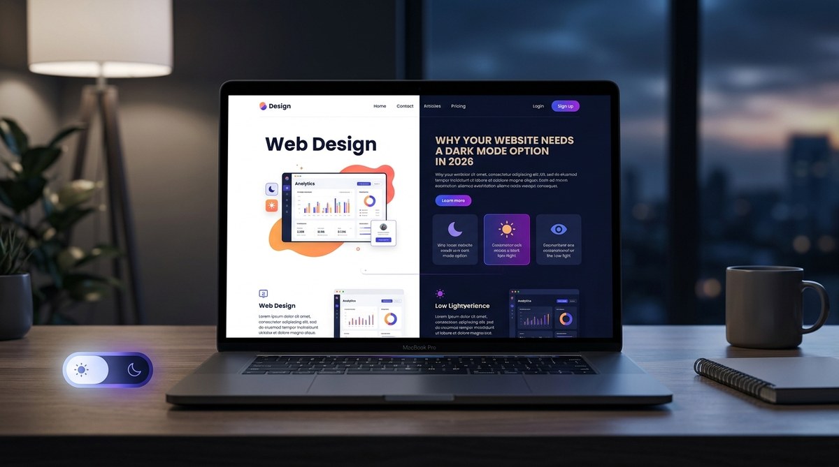
Dark mode is no longer a niche preference or a gimmick. In 2026, offering a dark mode option on your website is as expected as having a mobile responsive layout. Major platforms like YouTube, Instagram, and Twitter have offered dark themes for years, and user habits have solidified. People now associate dark mode with reduced eye strain, longer battery life on OLED screens, and a more immersive, modern feel. If your site still lacks a dark mode toggle, you’re not just missing a trend — you’re ignoring a fundamental expectation from your visitors. It’s time to treat dark mode as a core feature, not an afterthought.
Dark mode is a user expectation in 2026, not a luxury. It improves accessibility, reduces eye strain, saves battery life on OLED displays, and gives your brand a modern edge. This article covers why you need it, how to implement it correctly, and common pitfalls to avoid. Start planning your dark mode rollout today to keep your site competitive and user-friendly.
The Shift Toward Dark Mode Is Unstoppable
Let’s look at the numbers. A 2024 survey by a major tech publication found that over 80% of smartphone users enable dark mode at least some of the time. By 2026, that percentage has climbed even higher, driven by operating systems that default to dark themes based on time of day and by user fatigue with bright white interfaces. This isn’t a passing fad. It’s a behavioral shift.
Dark mode aligns with how we use screens in low-light environments — on the couch at night, in bed before sleep, or during a late-night work session. For website owners and designers, the question has moved from “Should we add dark mode?” to “How do we implement dark mode without breaking the design?” That’s what we’ll tackle here.
What Dark Mode Means for User Experience in 2026
User experience is at the heart of every design decision. Here’s what dark mode brings to the table:
- Reduced Eye Strain: Light text on a dark background minimizes glare and reduces the blue light exposure that interferes with sleep. Users who spend hours on your site will thank you.
- Battery Savings: On OLED and AMOLED screens, dark pixels consume less power. A dark UI can extend battery life by up to 30% on mobile devices.
- Improved Focus: Dark backgrounds can push content forward, making text and visuals pop. This is especially valuable for creative portfolios, photography sites, and ecommerce product pages.
- Accessibility: For users with visual impairments like photophobia or certain types of color blindness, dark mode can make reading easier and more comfortable.
But dark mode isn’t just about flipping colors. It requires thoughtful design. You can’t simply invert your CSS and call it a day. That’s where proper implementation comes in.
The Technical Side: How to Implement Dark Mode Properly
Follow these steps to add a robust dark mode to your site in 2026. Each step builds on the last.
-
Start with a CSS custom properties (variables) architecture. Define your colors as variables like
--color-backgroundand--color-text. This makes switching themes a matter of overriding the variable values in a[data-theme="dark"]selector. -
Use the
prefers-color-schememedia query as the fallback. If a user’s system is set to dark mode, your site should respect that automatically. This works as your base default, but give users a manual toggle as well. -
Add a manual toggle with JavaScript. Store the user’s preference in
localStorageso it persists across sessions. A simple sun/moon icon in the header works. -
Test every component. Images, buttons, forms, icons, and charts all need proper contrast. Don’t rely on automated inversion. For instance, a logo that works on white may vanish on black. Export a separate dark version.
-
Use semantic colors, not just light/dark pairs. Your primary button might be a vivid blue on light mode, but on dark mode you may need a slightly different shade to maintain contrast. Define separate accent variables for each theme.
-
Avoid pure black (
#000000). Use a very dark gray like#121212or#1a1a1ainstead. Pure black can create harsh contrast and cause halation (blurry text effect). A dark charcoal is easier on the eyes.
Common Mistakes to Avoid
Even seasoned designers stumble when implementing dark mode. Here’s a quick reference table of what to watch out for:
| Mistake | Why It Hurts | Fix |
|---|---|---|
| Inverting colors blindly | Makes images look like negatives, text hard to read | Use opacity or specific dark-mode styles for images; avoid full inversion |
| Ignoring contrast ratios | Light gray on dark gray fails WCAG AA guidelines | Stick to a contrast ratio of at least 4.5:1 for normal text |
| Forgetting shadows | Shadows that look natural on light backgrounds become invisible or weird on dark | Replace box shadows with luminosity-based depth (e.g., lighter borders or drop shadows) |
| Using pure black backgrounds | Creates uncomfortable eye strain and color fringing on some screens | Use dark gray (#121212 or #1c1c1c) |
| Skipping focus states | Keyboard users lose visual cues; accessibility suffers | Add a bright, high-contrast outline for focused elements in dark mode |
Accessibility and Dark Mode: A Crucial Pairing
Dark mode isn’t just a visual preference — it’s an accessibility feature. Users with migraines, light sensitivity, or conditions like Irlen syndrome often rely on dark interfaces to reduce discomfort. The Web Content Accessibility Guidelines (WCAG) do not mandate dark mode, but they do require high contrast. By offering a well-designed dark theme, you automatically improve your site’s accessibility for a large segment of users.
Expert Advice: “When designing dark mode, never rely on contrast alone. Use color, texture, and spacing to differentiate elements. A pure gray interface can feel flat. Add subtle color tints to buttons and links to keep them identifiable without relying on high brightness.” — Sarah L., Senior UX Designer, 2026
To go even further, consider allowing users to adjust the darkness level. Some people prefer a dim mode (mid-gray background) rather than full dark. A simple slider or three-level toggle (light / dim / dark) can set your site apart.
Dark Mode and Your Brand Identity
Worried that dark mode will clash with your brand colors? It doesn’t have to. Many brands now maintain two distinct color palettes — one for light and one for dark. Your logo might use a transparent version with a glow on dark backgrounds. Your accent colors may need to shift slightly to maintain the same emotional impact. For example, a bright orange that feels energetic on white can become overwhelming on black. Desaturate it a touch and you retain brand recognition without heating the user’s retinas.
If you’re refreshing your overall design direction, check out our guide on how to choose the perfect color schemes for modern web designs. It includes practical tips for building palettes that work in both light and dark environments.
Resources to Help You Get Started
You don’t need to build everything from scratch. Use these resources to speed up your dark mode implementation:
- CSS Variables Cheatsheet: Define your theme tokens in one place. There are dozens of open-source templates on GitHub.
- Color Contrast Checkers: Tools like WebAIM’s contrast checker let you validate your dark mode colors against WCAG standards.
- Design System Kits: Many UI libraries (like Bootstrap, Tailwind, or Material Design) now ship with official dark mode support. Leverage those.
- Icon Sets: If you use custom icons, make sure you have both light and dark variants. Our article on mastering icon design for custom web icons covers how to handle this gracefully.
- Typography Studies: Dark mode changes how we perceive weight and spacing. Read up on essential web design fonts to boost user engagement in 2026 for font recommendations that work across themes.
Future-Proof Your Website with Dark Mode
The web is moving toward user customization. People want to control how they consume content — from font size to color scheme to reading mode. Dark mode website 2026 is not just a trend; it’s a baseline expectation. By implementing it thoughtfully, you show your audience that you care about their comfort and their experience.
Start small. Add a toggle to your header. Set up CSS variables. Test your site at night with the lights off. You’ll see the difference. And once you’ve rolled out dark mode, don’t stop there. Look at other ways to improve your site’s accessibility and performance. Our guide on designing accessible web interfaces is a great next step.
Remember: your users are already using dark mode on their phones and laptops. Meet them where they are. Your site will feel more modern, more inclusive, and more in tune with the way people actually browse the web in 2026.