 By simon
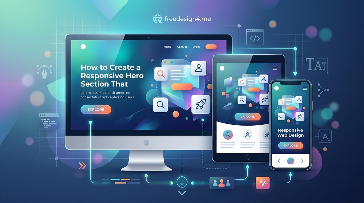
You have just a few seconds to make an impression. Every time someone lands on a site, their eyes scan the top of the page for a signal. Does this place look trustworthy? Do they get what I need? That top area, the hero section, carries the full weight of that first moment. When it works well, visitors stay, scroll, and click. When it fails, they bounce before reading a single sentence. Making that section responsive used to be an afterthought, something you handled with a few media queries at the end. But in 2026, users land on your site from phones, tablets, laptops, and even smart displays. A hero section that looks stunning on a 27 inch monitor but falls apart on a phone screen is no longer acceptable. You need a layout that flexes, images that scale, and copy that reads clearly at any width. This is not just about code. It is about designing a moment that works everywhere.
A responsive hero section adapts smoothly across phones, tablets, and desktops while keeping your core message clear and compelling. It uses flexible grids, fluid images, and smart CSS techniques to maintain visual impact at any screen size. When done right, it grabs attention within seconds, communicates your value proposition clearly, and guides visitors toward a single action. This guide covers essential components, common mistakes, and a practical build process for designers and developers.
What Makes a Hero Section Truly Responsive?
A responsive hero section is not the same as a hero section that simply shrinks down. True responsiveness means the layout, typography, imagery, and call to action rearrange themselves intelligently based on the device and viewport. On a desktop, you might have a wide background image with text overlaid on the left side. On a phone, that same text should stack cleanly, the image should crop or shift focus, and the button should be large enough to tap with a thumb.
Responsiveness also touches loading performance. A hero image that weighs 3 megabytes might load fine on a fiber connection, but it will punish someone on a cellular network. Using responsive image techniques like the srcset attribute or next generation formats such as WebP and AVIF keeps load times low without sacrificing quality.
Another layer is interaction. Hover effects, animations, and parallax scrolling can add energy on desktop, but they need graceful fallbacks on touch devices. A hover state that reveals a secondary headline does nothing for a tablet user who never hovers. Plan for touch first, then enhance for pointer devices.
Core Building Blocks of a Responsive Hero Section
Every strong hero section relies on a handful of essential pieces. When each piece is built with responsiveness in mind, the whole section holds together at any screen size.
- Headline. Short, benefit driven, and large enough to read on a phone without zooming. Keep it to six words or fewer if possible.
- Subheadline or supporting text. Adds context or reinforces the value promise. On mobile, this text can be shorter or even hidden behind a tap to reduce clutter.
- Primary call to action. One clear button that tells the user what to do next. Make it big enough to tap comfortably. On narrow screens, center it and give it plenty of padding.
- Background visual. This could be an image, a video, an illustration, or a gradient. The visual should scale, crop, or swap depending on the viewport.
- Overlay or treatment. A dark or colored overlay improves text contrast against busy backgrounds. On mobile, the overlay might need to be stronger because the image becomes smaller and more detailed.
- Navigation or skip link. Some hero sections tuck the main navigation inside the hero area. On mobile, that navigation collapses into a hamburger menu or slides in from the side.
These pieces work together, but they do not all need equal weight on every device. A desktop hero can afford a bold background video with text overlaid. A mobile hero might strip away the video, show a static image with a stronger overlay, and bump up the font size of the headline.
How to Build Your Responsive Hero Section in 3 Steps
Instead of starting from scratch with trial and error, follow a repeatable process. These three steps cover planning, building, and polishing.
-
Plan your content hierarchy for the smallest screen first. Write your headline and subtext for a 375 pixel viewport. If the message works in that tight space, it will only get better as the screen grows. Choose a primary action that makes sense on a phone. Then decide which decorative elements, such as illustrations or background videos, can be omitted on small screens. This mobile first approach forces you to prioritize what matters.
-
Build the layout with CSS Grid or Flexbox using relative units. Use
frunits for grid columns andclamp()for font sizes so the typography scales fluidly. Set the hero container tomin-height: 100dvhinstead of a fixed pixel height. That way it fills the viewport on any device, including those with dynamic toolbars. For the background image, use thepictureelement with multiple sources so large images only load on screens that need them. -
Test on real devices and adjust breakpoints where content breaks. Do not rely solely on browser DevTools. Pull out a phone, a tablet, and a laptop. Look for text that overflows, buttons that touch edges, and images that lose their focal point. Adjust your breakpoints based on content, not on popular device widths. If the headline wraps awkwardly at 700 pixels, add a breakpoint there. Use CSS media queries for both width and height, because a landscape phone presents different constraints than a portrait one.
After these three steps, you will have a hero section that works. But working is not the same as polished. The next step is refinement, which means checking for contrast, load speed, and visual balance.
Common Responsive Hero Mistakes and How to Fix Them
Even experienced designers slip into patterns that hurt responsiveness. The table below outlines frequent mistakes and the adjustments that solve them.
| Mistake | Why It Hurts | How to Fix |
|---|---|---|
| Fixed height on the hero container | Content gets clipped or leaves awkward whitespace on some devices | Use min-height: 100dvh or min-height: 100vh with padding |
| Background image with no focal point shift | The most important part of the image gets cropped on smaller screens | Add object-position or use the picture element with tailored crops |
| Font sizes set in px without scaling | Text looks tiny on phones or huge on large monitors | Use clamp() or relative units like rem with a fluid scale |
| Too many CTAs | Users face decision paralysis, especially on small screens | Keep one primary CTA. Move secondary links to a lower section |
| Animations that rely on hover | Touch users never see the effect, and it can cause jank | Use prefers-reduced-motion and make interactions work on tap |
| Weak contrast between text and background | Readability suffers on phones with bright outdoor screens | Increase overlay opacity on mobile and test with dark mode |
Each of these fixes is small, but together they transform a fragile layout into a resilient one. A couple of extra CSS rules and a thoughtful image selection process are all it takes.
Expert Advice on Performance and Visual Impact
Performance and visual quality are not opposites. You can have both if you make intentional choices. One principle that helps is to treat the hero section as the most performance critical part of your page. It is the first thing users download and the first thing they see.
“The hero section should load in under two seconds on a typical 4G connection. That means limiting the total transfer size to around 500 KB for all assets in that region. Use lazy loading for everything below the fold, but load the hero eagerly. Optimize your largest image first, because that single file often accounts for half the page weight.” – Performance best practices from the design community in 2026
This advice highlights a trade off that many designers overlook. A gorgeous hero image loses its power if it takes five seconds to appear. Users will not wait. They will scroll past a blank area or leave entirely. Compress aggressively, use modern formats, and consider using a lightweight CSS gradient or low quality image placeholder (LQIP) as a fallback while the full image loads.
Another area where performance meets design is in the choice of typography. Custom web fonts can add personality, but they also add weight. If you load three font files just for the hero section, you delay the render time. Pick one or two weights, subset the font files, and use font-display: swap so text remains visible while the font loads. For more guidance on selecting type that works across devices, check out our guide on essential web design fonts that keep your pages both beautiful and fast.
Color choice also plays a role in responsiveness. A color that looks vibrant on a desktop monitor might wash out on a phone screen with automatic brightness adjustments. High contrast combinations, such as dark text on a light overlay or white text on a dark gradient, tend to hold up better across devices. If you need help building a palette that stays legible everywhere, see our tips on choosing the perfect color schemes for modern layouts.
Designing for Every User and Every Screen
Responsiveness is not just about screen width. It also includes accessibility and user preferences. Some users browse with reduced motion enabled. Others use dark mode. Some rely on screen readers to navigate. A truly responsive hero section respects all of these.
Use the prefers-color-scheme media query to adjust the overlay or text color when dark mode is active. Use prefers-reduced-motion to disable parallax effects, fades, or auto playing videos. Write semantic HTML so a screen reader can announce the headline and the CTA in a logical order. An accessible hero section is not a separate project. It is just a well built one.
If you are new to inclusive design practices, the article on designing accessible web interfaces offers concrete steps for making your layouts work for everyone.
Keeping Your Hero Section Fresh in 2026
Design trends shift each year, but the fundamentals of a responsive hero section stay the same. Prioritize clarity. Keep load times low. Test on real devices. The best designers in 2026 are not the ones who follow every trend. They are the ones who build hero sections that load fast, read well, and guide users toward action, no matter what screen they hold.
For a broader look at what is shaping design this year, check out our roundup of top web design trends that are influencing layout, color, and interaction patterns.
Now take a look at your own hero section. Open it on a phone. Does the headline fit without scrolling? Can you tap the button without zooming? Does the image still communicate the same message at half the width? If the answer to any of those questions is no, you have a clear place to start. The process is simple: plan for the smallest screen, build with flexible units, and test until it feels right on every device in your hand.