 By simon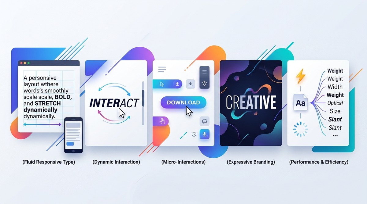
Variable fonts are changing how we think about type on the web. Instead of loading five separate font files to get different weights and widths, you can load one file and adjust its axes in real time. That means your headlines can shift from light to bold without a single extra HTTP request. Your body text can grow narrower on a phone and wider on a desktop without breaking a sweat. For designers and developers who care about performance and creative control, this is a big deal.
Variable fonts let you control weight, width, and optical size from a single file using CSS. This guide shows five creative ways to use them in your next project: responsive typography, interactive hover effects, dark mode adaptation, performance optimization through file reduction, and expressive variable font pairings. Each method includes real code snippets and practical advice to help you get started today.
What Makes Variable Fonts Different
Standard font families ship each style as a separate file. You need Roboto-Regular.woff2, Roboto-Bold.woff2, Roboto-Light.woff2, and so on. Variable fonts (also called variable fonts or OpenType variable fonts) bundle all those styles into one file. You control the output through CSS properties like font-weight, font-width, and font-optical-sizing.
The result is a single file that can act like dozens of individual fonts. That saves bandwidth, simplifies your CSS, and opens up design possibilities that static fonts cannot match.
1. Responsive Typography That Adapts to Screen Size
One of the most practical uses for variable fonts is making your type respond to viewport changes. Instead of switching font families at different breakpoints, you can adjust the font weight or width gradually.
Here is how you might set that up in CSS:
body {
  font-family: 'MyVariableFont', sans-serif;
  font-weight: 350;
}

@media (max-width: 768px) {
  body {
    font-weight: 300;
  }
}

@media (min-width: 1200px) {
  body {
    font-weight: 450;
  }
}
This approach keeps your design consistent. The font stays the same, but its appearance shifts to match the available space. On a phone, lighter weight improves readability at small sizes. On a large monitor, a heavier weight adds presence.
You can pair this technique with other responsive strategies. For example, combine variable fonts with a fluid grid system to create layouts that feel intentional at every size. If you want to see how this fits into a broader responsive toolkit, check out our guide on how to create a responsive hero section that captivates users.
2. Interactive Hover Effects Without Extra Assets
Hover effects usually rely on swapping between two separate font files. That means preloading both files and hoping the swap does not cause a flash of unstyled text. Variable fonts eliminate that problem.
You can transition between weights using CSS transitions:
h2 {
  font-family: 'MyVariableFont', sans-serif;
  font-weight: 400;
  transition: font-weight 0.3s ease;
}

h2:hover {
  font-weight: 700;
}
The browser interpolates the weight change smoothly. No flicker. No extra file loading. This works especially well for navigation links, call-to-action buttons, and card titles where you want a subtle visual cue.
For more ideas on using micro-interactions to improve user experience, take a look at our article on 10 micro-interactions that will transform your web design UX in 2026.
3. Dark Mode Adaptation Made Simple
Dark mode is no longer optional. Users expect it, and browsers now support it natively through the prefers-color-scheme media query. But adjusting typography for dark mode is about more than just inverting colors. A font that looks crisp on a white background can feel too heavy on a black one.
Variable fonts let you fine-tune the weight for each mode:
body {
  font-family: 'MyVariableFont', sans-serif;
  font-weight: 400;
}

@media (prefers-color-scheme: dark) {
  body {
    font-weight: 350;
  }
}
Reducing the weight by a small amount prevents the text from looking bloated against a dark background. You can also adjust the font width to make characters breathe more in low-light environments.
This technique pairs well with a broader dark mode strategy. If you are building a site that needs to look great in both themes, read our guide on why your website needs a dark mode option in 2026.
4. Performance Gains Through Fewer Font Files
Every font file you load adds to your page weight. A typical project might use four or five weights of the same typeface. That can add up to 100KB or more. Variable fonts compress all of those styles into a single file, often around 30KB to 50KB.
Consider this comparison:
| Approach | Files needed | Total size (approx) | HTTP requests |
|---|---|---|---|
| Standard fonts | 5 (Light, Regular, Medium, Bold, Black) | 120KB | 5 |
| Variable fonts | 1 | 40KB | 1 |
Fewer requests mean faster load times. Faster load times mean better user retention and higher conversion rates. This is especially important for mobile users who may be on slower connections.
To see how this fits into a larger performance optimization strategy, check out our guide on how to implement lazy loading for faster web design performance in 2026.
5. Expressive Variable Font Pairings
Variable fonts shine when you use them to create contrast within a single typeface. You can set your headings to a heavy, condensed weight and your body text to a light, extended weight. The visual relationship stays cohesive because both come from the same font family.
Here is an example pairing:
h1 {
  font-family: 'MyVariableFont', sans-serif;
  font-weight: 800;
  font-width: 75;
}

p {
  font-family: 'MyVariableFont', sans-serif;
  font-weight: 350;
  font-width: 110;
}
The font-width property controls how narrow or wide the characters appear. A value of 100 is normal. Values below 100 compress the letterforms. Values above 100 stretch them. This gives you control over texture and density without switching fonts.
You can also use variable fonts to create a hierarchy that feels more organic. Instead of jumping from Regular to Bold, you can step through intermediate values. Your design can have five or six distinct levels of emphasis using a single font file.
For more ideas on combining type in your projects, take a look at our resource on enhance your designs with modern font pairing techniques.
Common Mistakes to Watch For
Variable fonts are powerful, but they come with a few pitfalls. Here is a table of what to avoid and how to fix it:
| Mistake | Why it hurts | Fix |
|---|---|---|
| Using extreme weight values | Can make text unreadable at small sizes | Stay between 300 and 700 for body text |
| Ignoring browser support | Some older browsers do not support variable fonts | Provide a fallback font stack in @font-face |
| Setting font-width too low | Characters become illegible | Keep font-width above 60 for body copy |
| Not testing on real devices | Variable fonts may render differently across platforms | Test on iOS, Android, Windows, and macOS |
Expert tip: Always define a fallback. Use
@font-facewith asrcpointing to your variable font, then add afont-display: swapto prevent invisible text while the font loads. This keeps your site usable even if the variable font fails to load.
Putting Variable Fonts Into Your Workflow
If you are ready to start using variable fonts in your next project, here is a simple process to follow:
- Choose a variable font that supports the axes you need (weight, width, optical size). Many foundries now offer variable versions of popular typefaces.
- Host the font file on your server or use a CDN that supports variable fonts.
- Declare the font in your CSS using
@font-facewith thefont-variation-settingsdescriptor. - Set baseline values for
font-weightandfont-widthon your body element. - Adjust those values in media queries for responsive behavior, dark mode, or hover states.
- Test the font at multiple sizes and weights to confirm readability.
This workflow fits into any modern design system. If you are building a cohesive set of styles for a large project, our guide on how to build a cohesive design system for your web projects in 2026 can help you structure everything.
The Future of Typography on the Web
Variable fonts are not a passing trend. They solve real problems around performance, flexibility, and creative control. As browser support grows and more type foundries release variable versions of their catalogs, this approach will become the standard way to deliver type on the web.
For designers who want to stay ahead, now is the time to experiment. Start with a single project. Pick a variable font. Replace your usual stack of Regular, Bold, and Italic files. See how much faster your pages load and how much more control you have over your typography.
Once you see the difference, you will wonder why you ever loaded five files to get one typeface.