 By simon
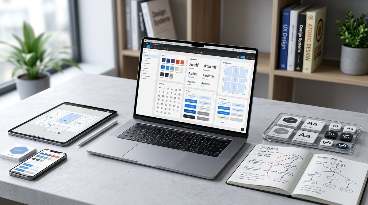
Building a design system used to feel like a luxury reserved for enterprise teams with dedicated staff. Not anymore. In 2026, the tools have matured, AI assistants can write tokens from a screenshot, and even a two-person studio can assemble a cohesive library that keeps their sites consistent. But consistency is only half the prize. A well thought out system also speeds up development, reduces decision fatigue, and makes onboarding new collaborators painless. Whether you are a freelance web developer or part of a growing product team, knowing how to build a design system that works for real projects is a skill that pays off every single sprint.
A design system in 2026 is more than a component library. It combines design tokens, responsive patterns, accessibility standards, and AI readable specs to keep interfaces consistent across teams and tools. Start small with a color palette and type scale, then grow methodically. The goal is not perfection but a shared language that makes every project faster and more inclusive.
Why a Design System Matters More This Year
The web landscape in 2026 moves fast. AI code generators, automated layout tools, and collaborative handoff platforms have lowered the barrier to publishing. But that speed comes with a risk: inconsistency. Without a central system, your homepage might use a different button radius than your checkout page. Your primary blue could shift by a few hex values across screens. Each small drift erodes trust and creates visual noise.
A design system acts as the single source of truth. It defines the rules for spacing, color, typography, iconography, and interaction patterns. When everyone on the team follows the same guide, the product feels intentional. Users notice the polish, and developers spend less time guessing values.
In 2026, there is another reason to build one: AI readiness. Many AI coding assistants and design plugins can read design tokens and component specs. If your system is structured in a machine readable format (like JSON design tokens or CSS custom properties), AI tools can generate code that matches your brand without manual tweaking.
What a Modern Design System Includes
A design system is not a single thing. It is a collection of interconnected assets and guidelines. Here are the core layers you need to build a design system in 2026:
- Design Tokens are the atomic units: colors, spacing, typography sizes, shadows, and border radii. Store them as JSON or CSS custom properties so they work across Figma, code, and AI tools.
- Component Library holds reusable UI elements like buttons, inputs, cards, and navigation bars. Each component should support states (hover, focus, disabled, error) and responsive behavior.
- Patterns and Templates show how components come together. Example patterns include a search results page layout, a signup form flow, or a product card grid.
- Guidelines and Documentation explain the rationale behind choices. Include usage rules, do and don’t examples, and accessibility notes.
- Iconography and Illustration System ensures visual assets share a common style. Use SVG icons with consistent stroke widths and sizing.
- Voice and Tone Direction even if brief, helps copywriters match the product’s personality.
A Step by Step Process to Build Your System
Let’s walk through a practical sequence you can follow today. This method works for a new project or for retrofitting an existing site.
- Audit your current interfaces. Collect screenshots of all current pages and components. Note inconsistencies in colors, corner radiuses, font sizes, and spacing. Use a tool like a design audit board (Figma or Miro) to tag problems.
- Define your design tokens first. Start with a color palette (primary, secondary, neutral, and semantic colors like success, warning, error), a type scale (4 to 6 sizes), and a spacing scale (multiples of 4px or 8px). Export these tokens as CSS custom properties.
- Build your first components. Choose the most common UI elements: buttons, input fields, checkboxes, radio buttons, modals, and cards. Build them with the tokens you defined. Make sure each component has hover, focus, and disabled states.
- Add accessibility from the start. Use color contrast ratios that meet WCAG 2.2 AA standards. Include focus outlines. Label all icon buttons for screen readers. For more detailed guidance, check out this resource on designing accessible web interfaces.
- Create documentation as you go. For each component, write a short note describing when to use it and when not to. Include code snippets and Figma component links. Keep the docs living alongside your code repository.
- Integrate with your toolchain. Connect your tokens to your design tool (Figma variables, for instance) and your codebase via a JSON token file or a package like Style Dictionary. Use a tool that auto generates CSS from tokens.
- Test on real pages. Apply the components to three different templates (homepage, product listing, checkout). Check for layout consistency on mobile, tablet, and desktop. Adjust token values if needed.
- Iterate with feedback. Share the system with your team. Ask developers if they find the token naming clear. Ask designers if the component variations cover their use cases. Update accordingly.
Common Techniques and Mistakes to Avoid
The table below summarizes best practices and pitfalls to watch for when you build a design system.
| Technique | Why It Works | Common Mistake |
|---|---|---|
| Use a single source of truth for tokens (JSON or CSS custom properties) | Ensures every tool and every developer pulls the exact same value | Maintaining separate token files for Figma and code that drift apart |
| Build responsive components with mobile first breakpoints | Prevents layout issues and keeps CSS lean | Creating components only at desktop width and retrofitting later |
| Write clear usage guidelines for each component | Reduces misuse and unnecessary variants | Assuming everyone will infer the correct usage from the component name |
| Include accessible states (focus, disabled, error) in every component | Makes the system inclusive and reduces bug reports | Adding accessible states only after a complaint or audit |
| Keep the component count small (aim for 15 20 core components) | The system stays manageable and easy to learn | Over engineering with dozens of micro components that confuse the team |
How AI Is Changing Design Systems in 2026
AI tools have become active participants in the design process. They can generate component variants, suggest tokens from a brand image, and even write documentation. But AI works best when it has a structured system to reference.
“The design system is not just for humans anymore. AI agents use the same tokens and patterns to generate code. If your system is well structured, the AI will produce consistent output that matches your brand without extra prompting.” — from a conversation with a design systems lead at a major ecommerce platform.
To make your system AI ready, use machine readable formats. Store tokens as JSON. Name components with predictable patterns (e.g., ButtonPrimary, ButtonSecondary). Include metadata for each component such as category, description, and allowed contexts. This allows an AI design tool to suggest the right component for a new page section.
Also consider that AI can help you maintain the system. You can set up a automation that scans your codebase for token usage and flags any hard coded values that should come from the system. This kind of governance keeps the system healthy as your project grows.
Governance Without the Bureaucracy
A design system only stays cohesive if people follow it. Governance is about making the easy path the correct path, not about enforcing rules with red tape.
- Keep the system visible. Embed component examples in your design tool and link to them from your code documentation. The less friction to find the right component, the more people will use it.
- Review new components before adding them. When a designer or developer proposes a new variant, ask: “Can we achieve this by composing existing components or by changing a token?” Only add a new component when the existing set truly cannot handle the use case.
- Use linters and automated checks. Tools like Stylelint can warn when a CSS value does not match a design token. CI checks can fail a pull request if a developer uses a hard coded color.
- Celebrate contributions. When someone improves a component or adds helpful docs, shout it out. Positive reinforcement builds a culture around the system.
Putting It All Together: Your First Week Plan
If you want to build a design system for a new project this week, here is a realistic plan:
- Day 1: Audit existing visuals and define the color and spacing tokens.
- Day 2: Create a basic type scale and build the button and input components.
- Day 3: Add accessibility (contrast, focus states, labels).
- Day 4: Write usage documentation for those two or three components.
- Day 5: Apply the components to one real page. Iterate on tokens based on what you see.
That gives you a working foundation. From there, you can add more components, create pattern templates, and integrate AI tooling. For ideas on what to build next, check out the top web design trends to elevate your projects in 2026 for inspiration on component patterns that feel fresh.
From System to Habit
A design system is not a finished project. It is a living asset that grows with your product. When you build a design system in 2026, you are not just organizing buttons and colors. You are creating a shared language that makes your team faster, your product more accessible, and your brand more recognizable. Start with tokens. Add a few components. Write a bit of guidance. Then use it every day. The system will repay the effort tenfold in consistency and peace of mind.